
JaxJin
JaxJin is a gin brand developed for Lot.01 Distillery, designed to balance heritage and contemporary appeal within a competitive, design-led spirits market.
A small survey was conducted to understand how consumers perceive premium and artisanal gin.
The findings highlighted a strong link between minimal design, tactile details and perceived authenticity, informing a direction focused on clarity, materiality and restraint.
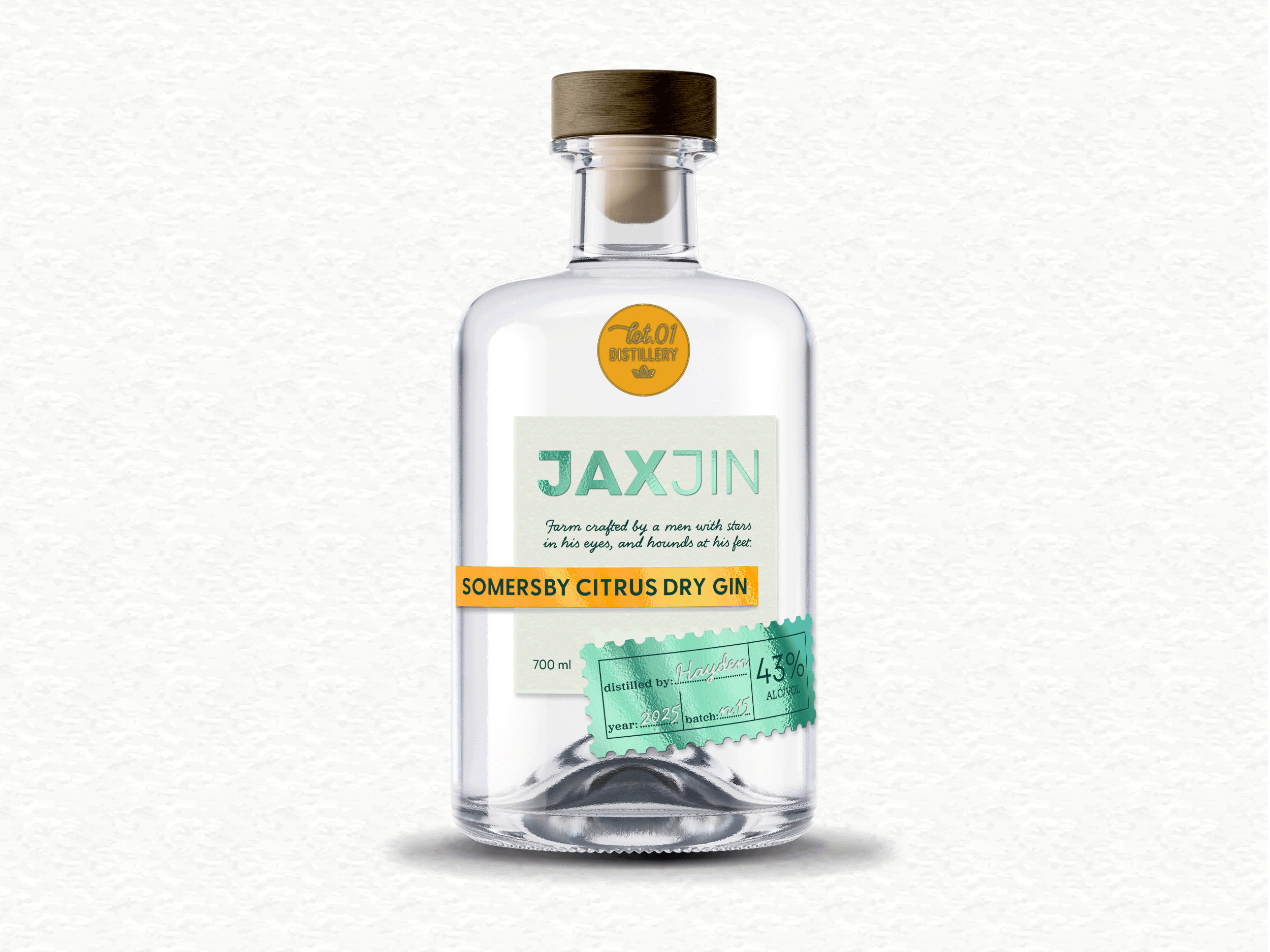
The identity combines contemporary minimalism with rustic cues. A restrained palette of paper tones is paired with a client-specified aqua/mint green to introduce freshness while maintaining a natural base.
Typography balances clean sans serif type with handwritten details, reinforcing both precision and craft.
An asymmetrical layout creates movement and avoids a static, traditional feel, while material finishes including textured paper, foil, and considered wax elements enhance the tactile experience.
Stamp motifs are used as a core device, referencing heritage, origin and trust.
The result is a cohesive visual system that bridges past and present, positioning JaxJin as a contemporary product with a strong sense of authenticity and place.
Deliverables:
-
Brand Identity
-
Label Design
-
Supporting assets


